Impact Data
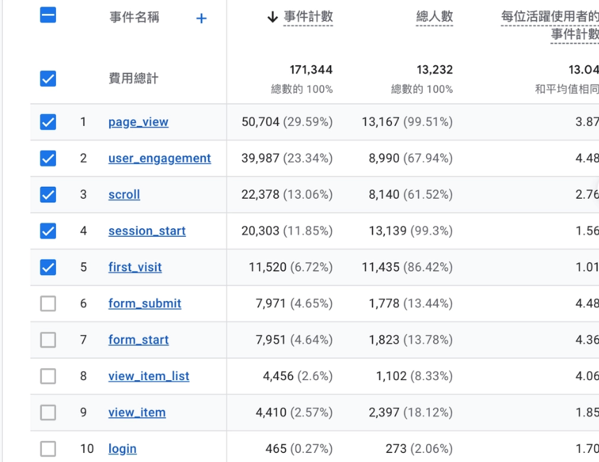
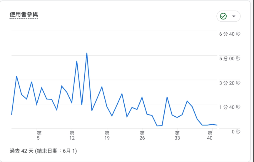
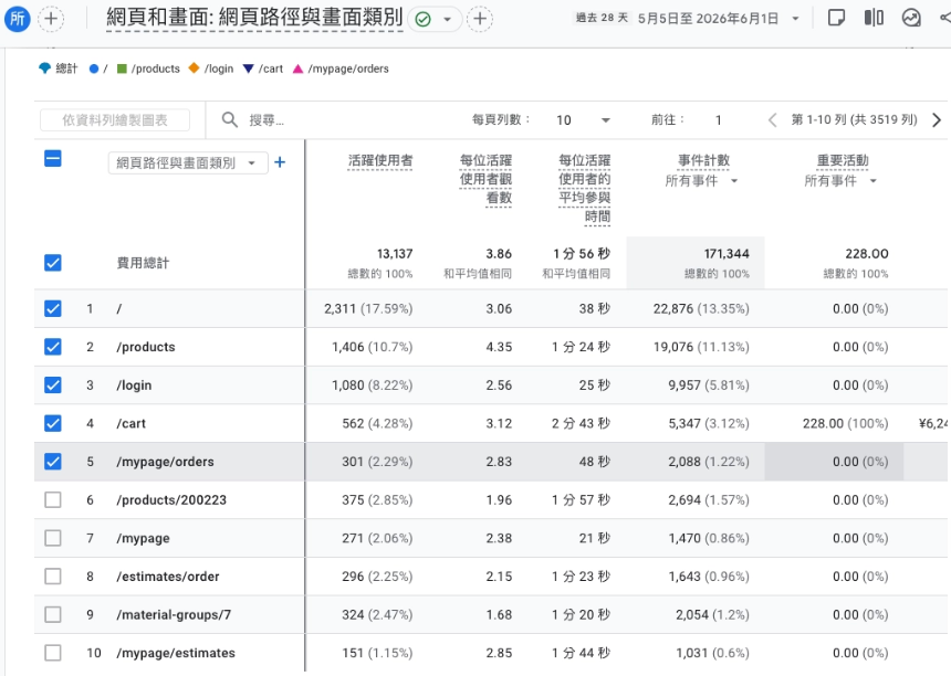
GA4 screenshots are intentionally softened in the portfolio view to protect operational details while keeping the business signals visible.
Storefront Entry
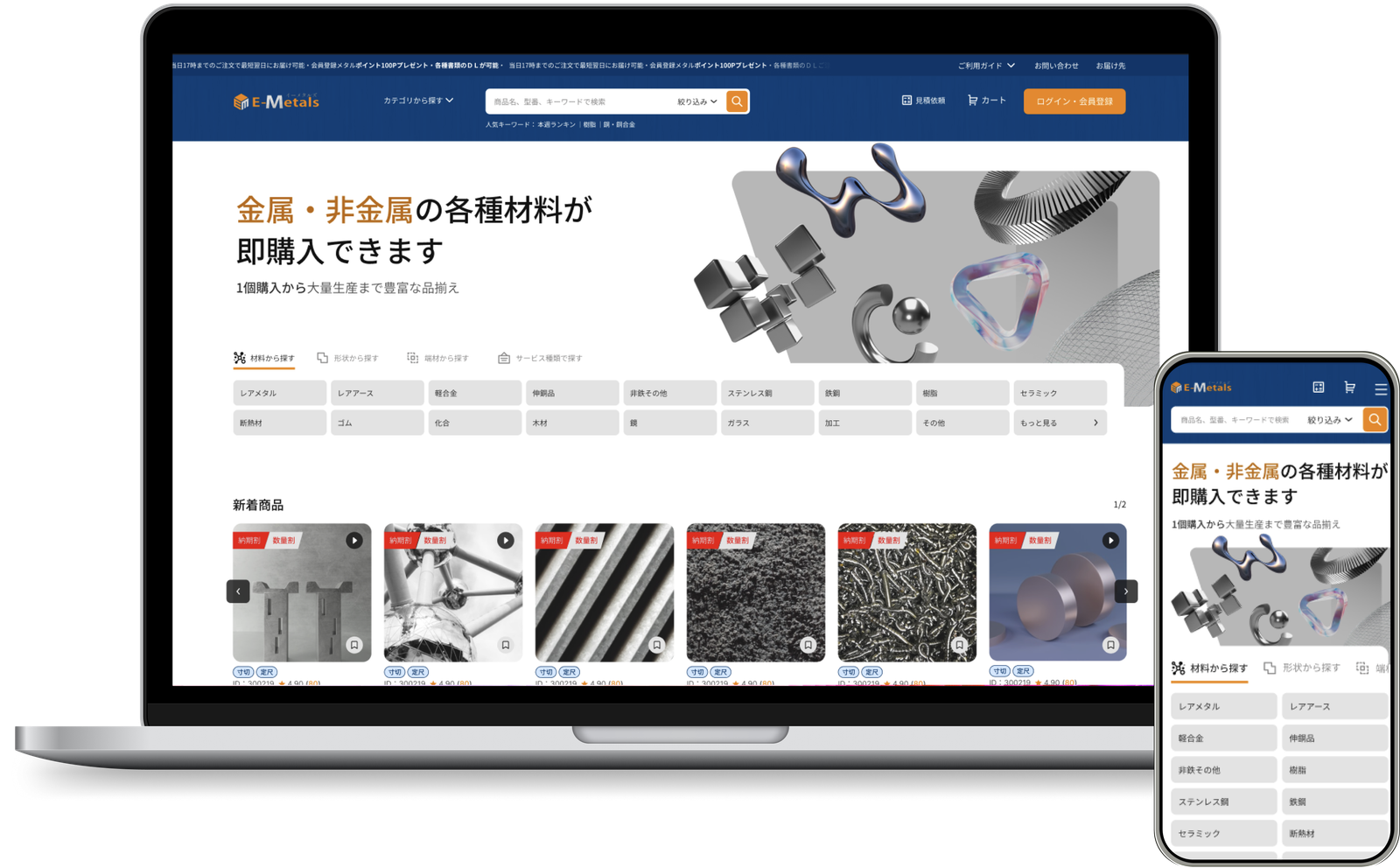
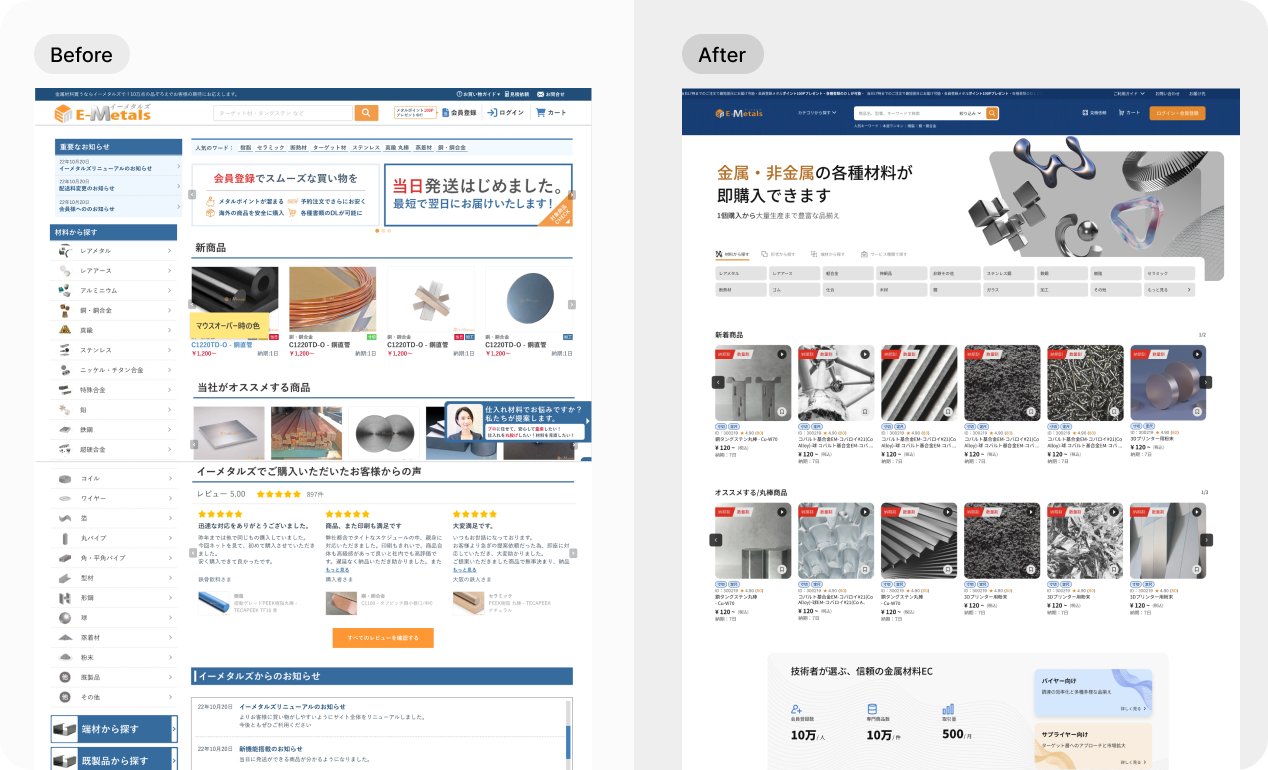
Turning a large material catalog into task-based entry points
The homepage needed to serve both professional buyers who know exactly what material they need and less specialized users who start from shape or service type. I structured the first screen around three discovery paths, then kept the visual language consistent across desktop and mobile so users can enter the catalog without learning a new navigation model.
Product Detail
Designing a clearer decision path for industrial product variations
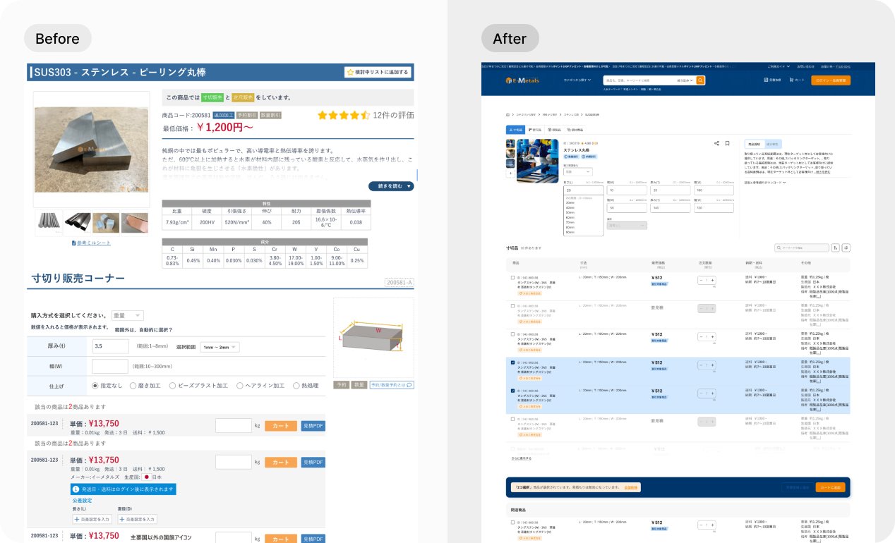
The product detail page supports multiple states within the same material, including cut-to-size, fixed-size, finished goods, and end-material products. I reorganized the page around a product-type switch, product imagery, purchase unit, dimensional inputs, and product description so buyers understand the decision before entering values.
Dimensional constraints, range suggestions, and disabled states stay close to the input fields, keeping error prevention at the decision point.
Product type before specification input
Placing product-type tabs above the configuration area helps users choose the correct buying mode before reading detailed specs or entering dimensions.
Error prevention at field level
Range hints, disabled controls, and visible constraints reduce trial-and-error for high-variance industrial dimensions.
Purchase and quotation readiness
The page supports both direct purchase and quotation evaluation without forcing users to leave the product context too early.
Basic / Advanced mode for deeper specification control
The next product detail iteration will introduce a Basic / Advanced mode to further reduce cognitive load. Common purchase tasks stay lightweight, while expert users can open advanced settings for special processing conditions, edge cases, and more granular specification inputs.
Cart & Inquiry Flow
Designing for two buying modes in one cart
Industrial e-commerce rarely follows a single, straight checkout path. Depending on spec-standardization and backend supplier data, buyers are split into two distinct pipelines right after the Product Detail Page (PDP).
To eliminate cognitive chaos, I designed a decoupled dual-channel infrastructure: e-commerce products with instant prices are routed to the Standard Shopping Cart, while non-standard customized cutting items are channeled to a dedicated Quotation Request Cart. Both pipelines function independently with optimized submit flows, preventing users from mixing transactional checkouts with long-tail approval requests.
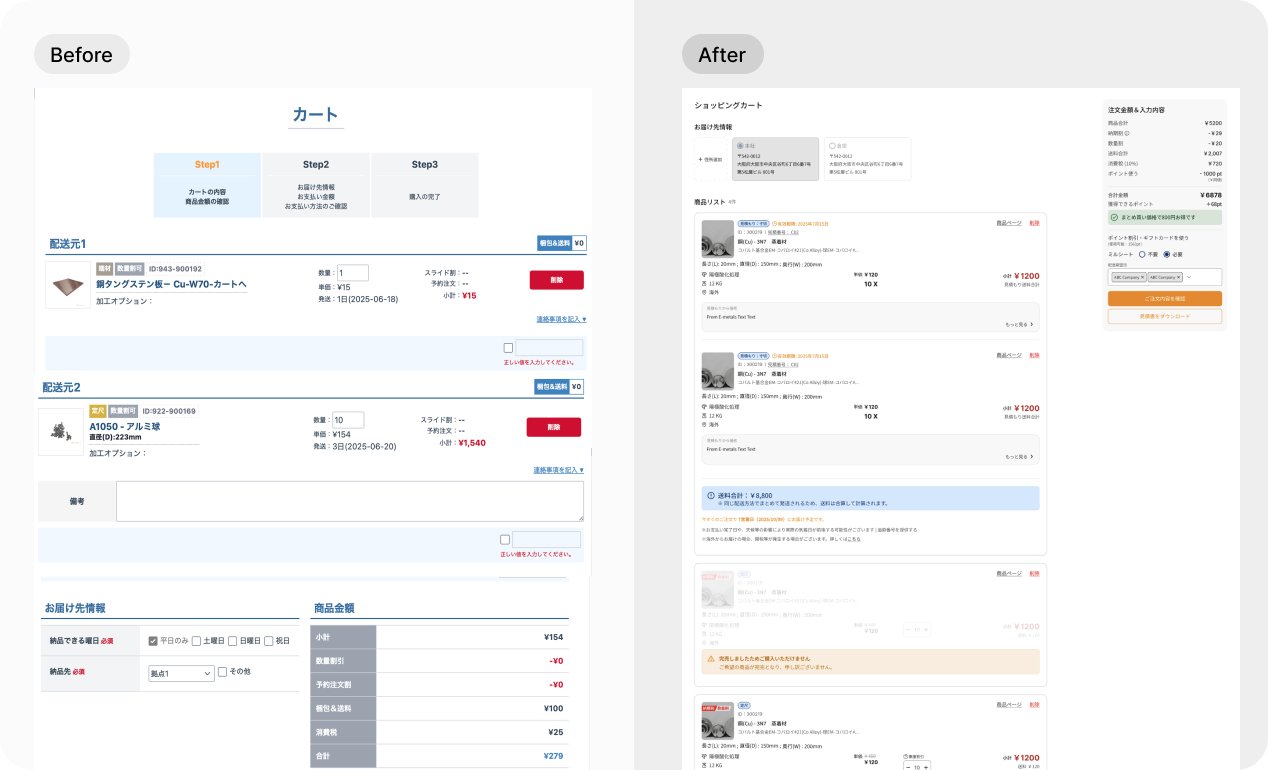
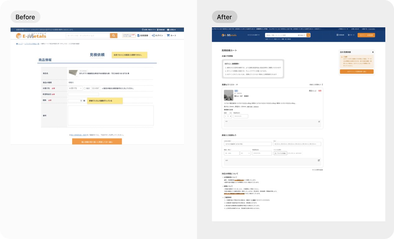
Clarified purchase readiness
Users can thoroughly review high-purity material specs, custom cut processing dimensions, and volume thresholds at the PDP milestone, ensuring data accuracy before routing to their respective cart pipelines.
State-aware actions
By isolating purchasable items from quote-required rows via conditional rendering, the interface dynamically activates separate submit pipelines. This hard-coded layout segregation effectively eliminates wrong-path decisions before users enter either the cart or the inquiry wizard.
Design System
One designer, a large system, and a need for repeatable quality
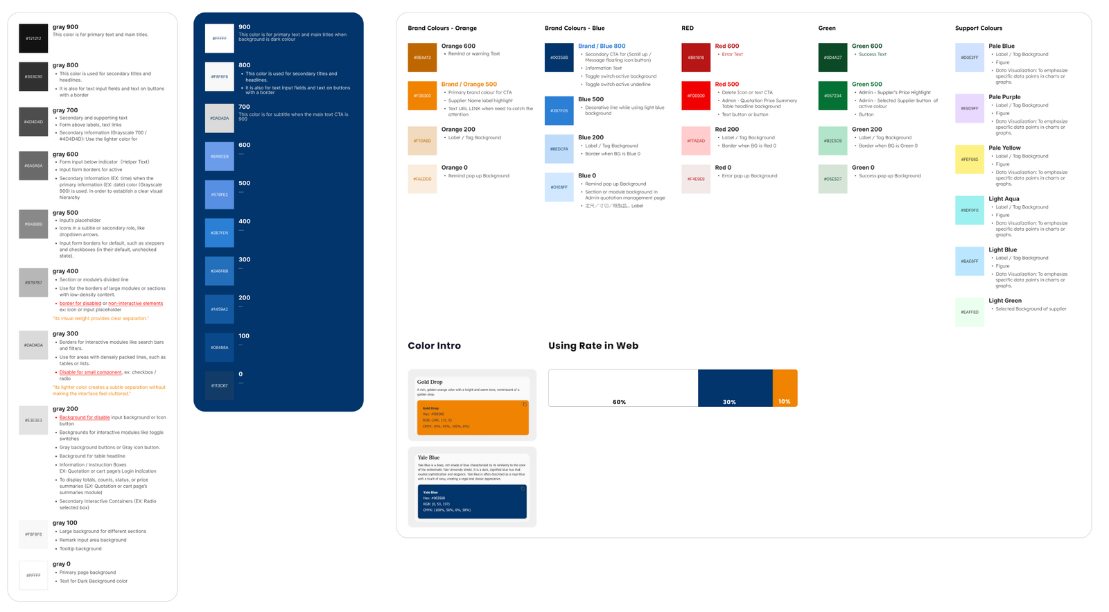
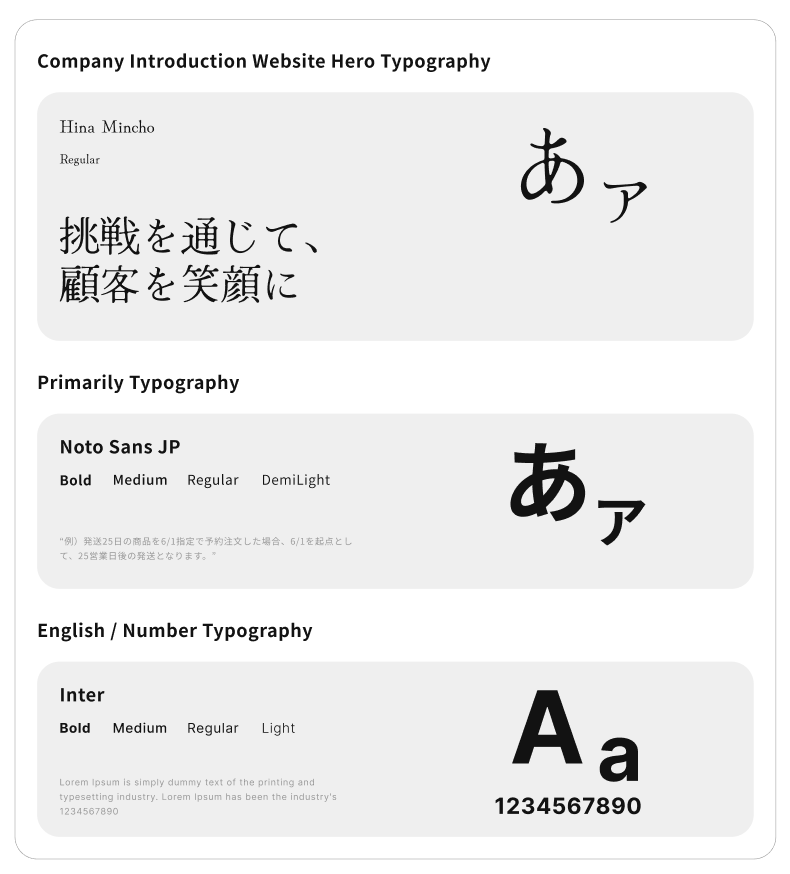
As the only UI/UX designer, I built a storefront UI kit in Figma with an 8pt grid, semantic spacing roles, component states, color tokens, and typography guidance. This reduced ambiguity with engineers and created a foundation for the ongoing My Page redesign.